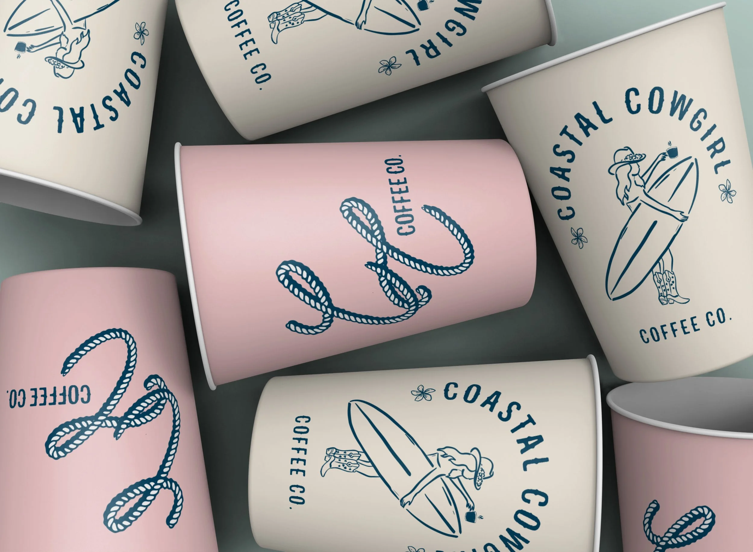
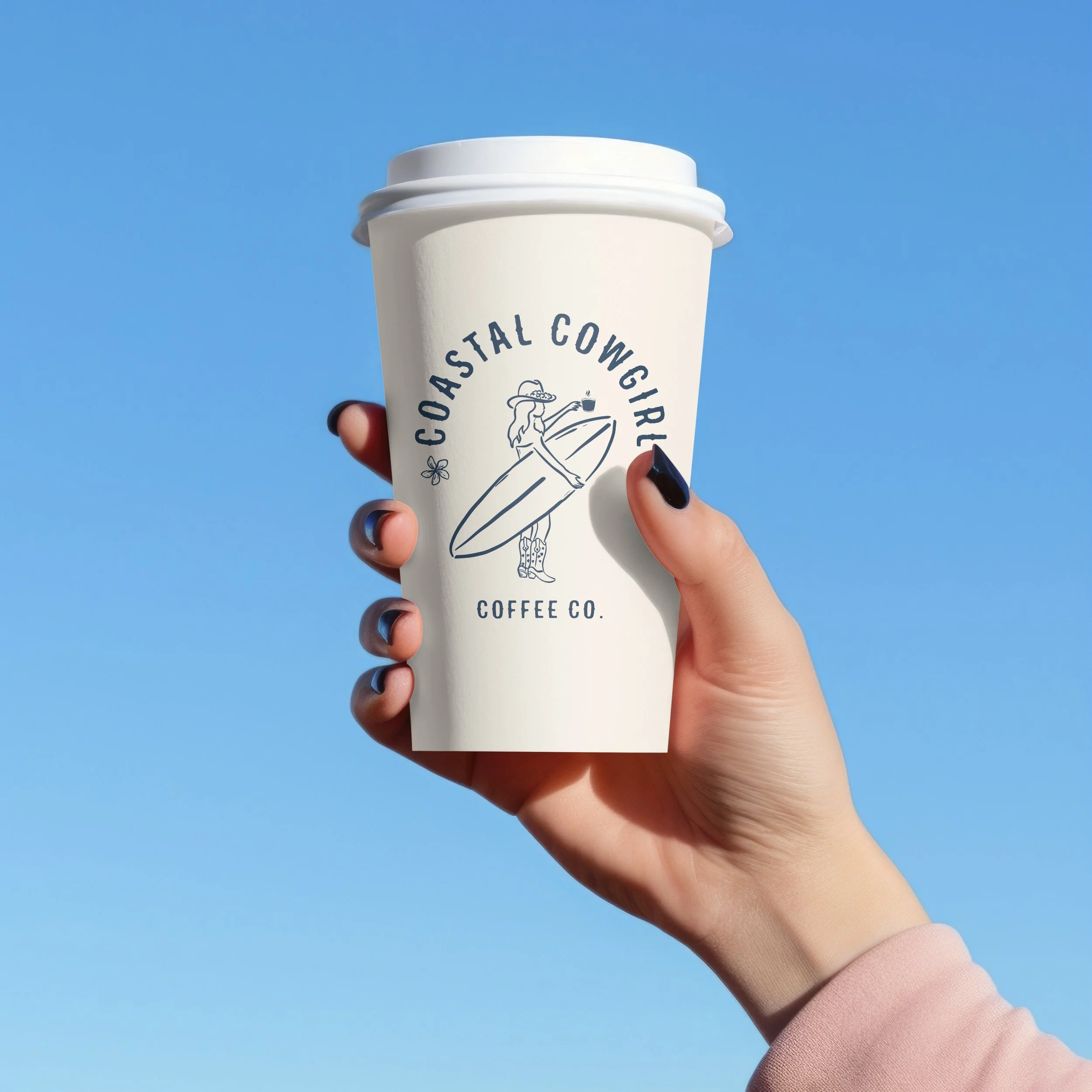
I've always had a passion for coffee, and when the opportunity arose to realize my dream of opening a coffee shop, I eagerly began the process of designing its branding. I meticulously considered every aspect, from the color palette to the overall aesthetic, to create a welcoming and memorable experience for my customers.

The design of this coffee bag is intentionally crafted to evoke a coastal chill vibe, which is reflected in my choice of colors—blue and light cream. The blue symbolizes the serene ocean and sky, while the light cream adds an element of warmth and approachability, reminiscent of sandy shores.
Furthermore, the illustration of the cowgirl holding a coffee cup, alongside the surfboard logo, embodies a unique fusion of coastal culture and the adventurous spirit of the West. This imagery not only highlights the laid-back lifestyle associated with both surfing and coffee enjoyment but also connects with a diverse audience who appreciate both the beach and rustic charm. By blending these elements, the design aims to create a strong sense of place and lifestyle, inviting customers to experience the essence of relaxation and enjoyment that our coffee embodies.

In addition to this signature flavor, I plan to introduce a variety of other coffee flavors, each featuring distinct color schemes that represent their unique profiles. This approach not only enhances the visual appeal of our product offerings but also allows customers to easily identify and associate different flavors with their corresponding colors. By blending these elements, the overall design aims to create a strong sense of place and lifestyle, inviting customers to experience the essence of relaxation and enjoyment that our coffee embodies.